CLIENT NAME: PINK FUND
Real help for the other part of the fight
THE ASK:
Pink Fund was being overlooked in the highly saturated breast cancer cause-marketing space, with the lion’s share of corporate sponsorships and individual donations going to more well-known cancer not-for-profits. Yet Pink Fund was championing another very important, very real part of the breast cancer fight: financial toxicity.
A study by the University of Michigan found that women will often forgo treatment if they cannot afford to provide for their family or pay for other necessities – mortgage, auto, utilities. Our job was to help open the aperture on this important issue and inspire corporate and individual donors. We wanted to make sure women got “Real Help for the Other Part of the Fight.”
Purpose-led campaign of the year – Ad Age
More funds raised vs. any year
30% increase in new grants
62% increase in fundraisers

BRANDING
Davey playing in Goliath’s sandbox
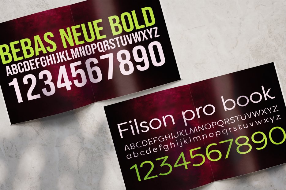
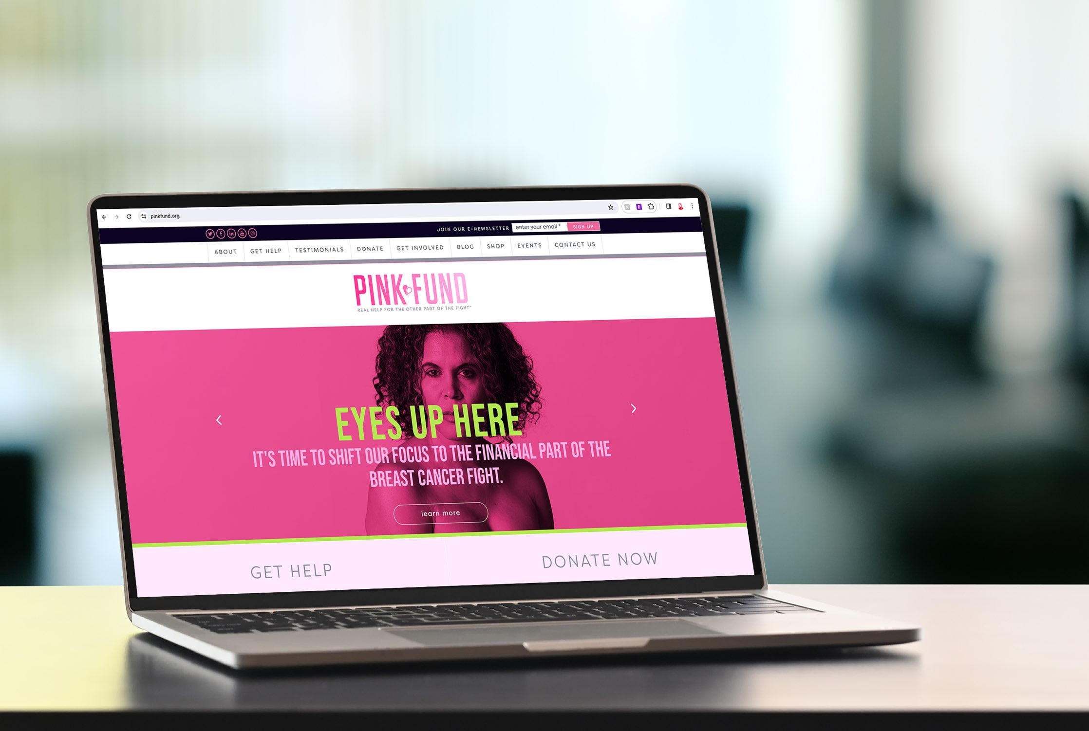
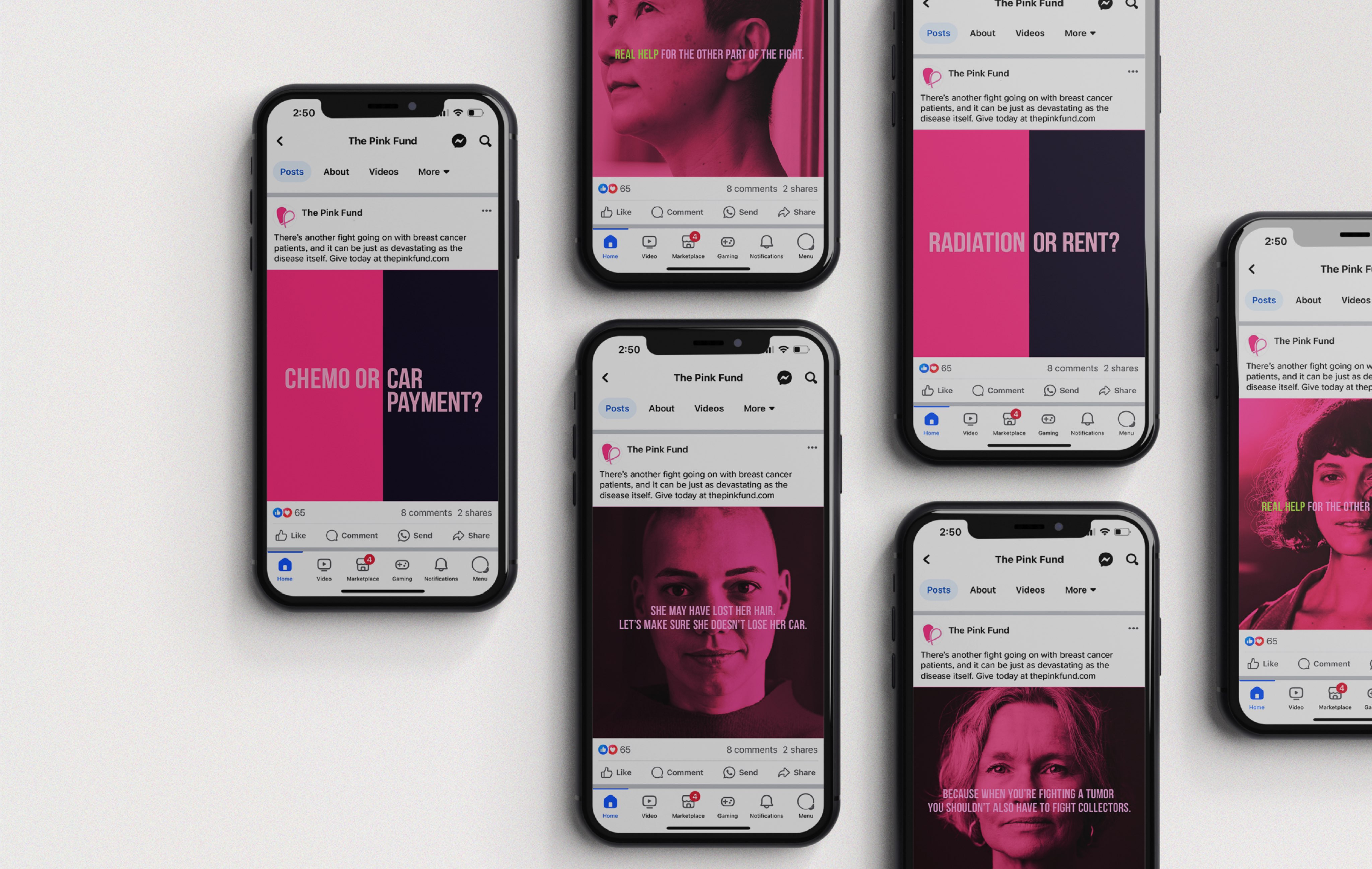
The breast cancer space has hefty competition spending hefty dollars. For Pink Fund, it was critical to have an impactful, cohesive look, feel and tone to maximize a smaller budget. We created a consistent brand language and tone of voice that changed the narrative in the crowded breast cancer awareness space — bringing attention to the other part of the fight. The objective was to give them the components they needed to position themselves as a national player in order to scale the brand and increase support.
LAUNCH
We came out fighting
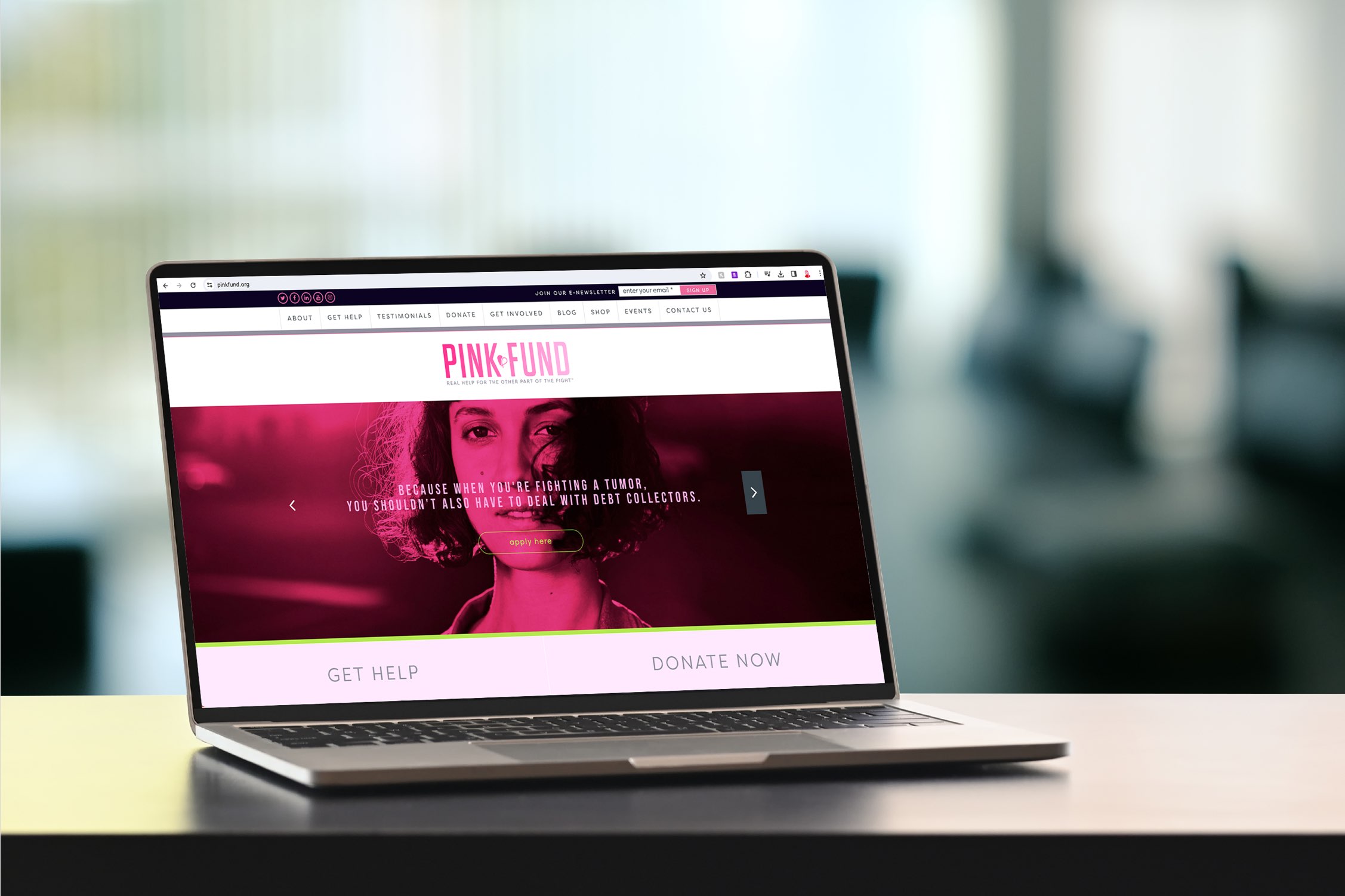
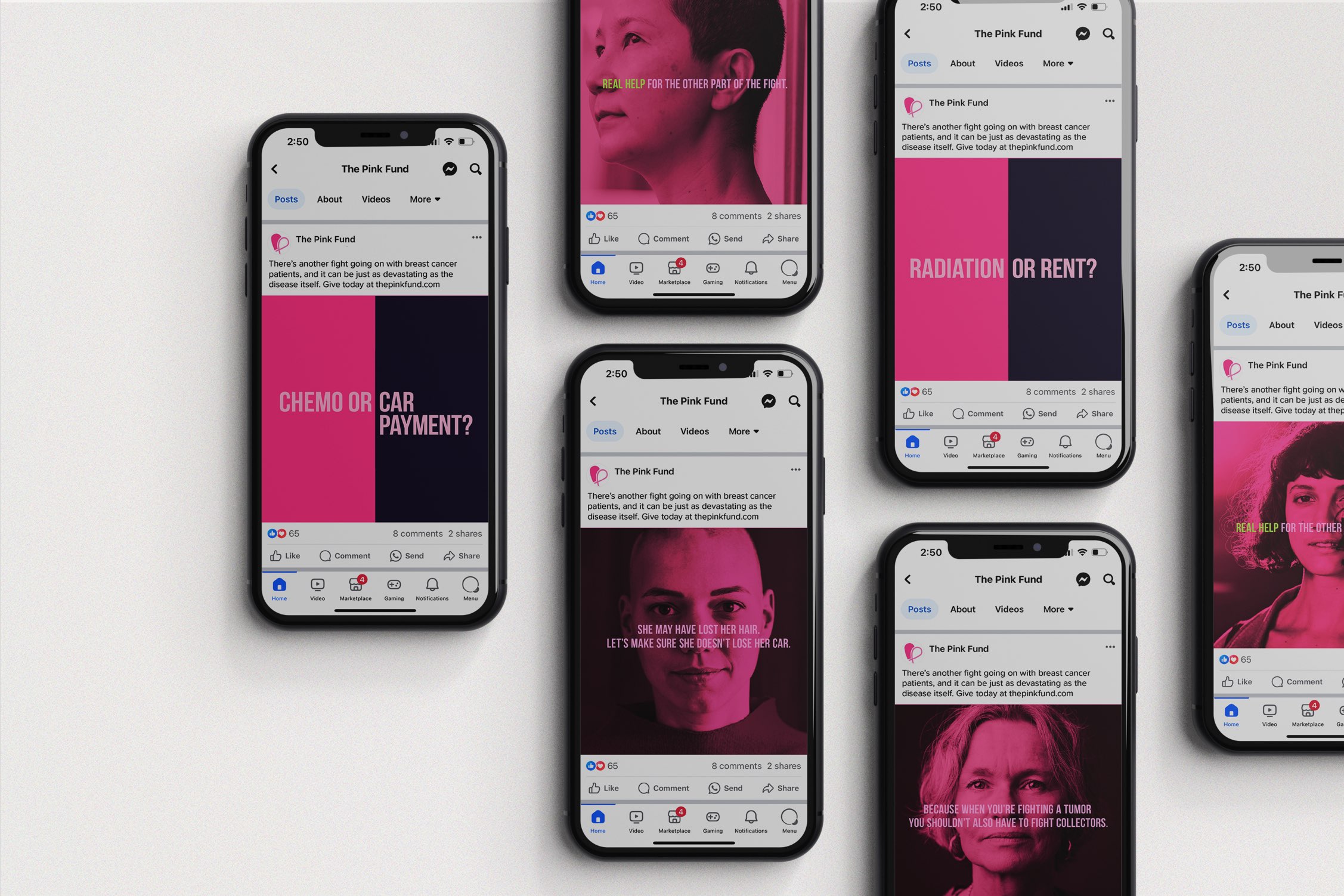
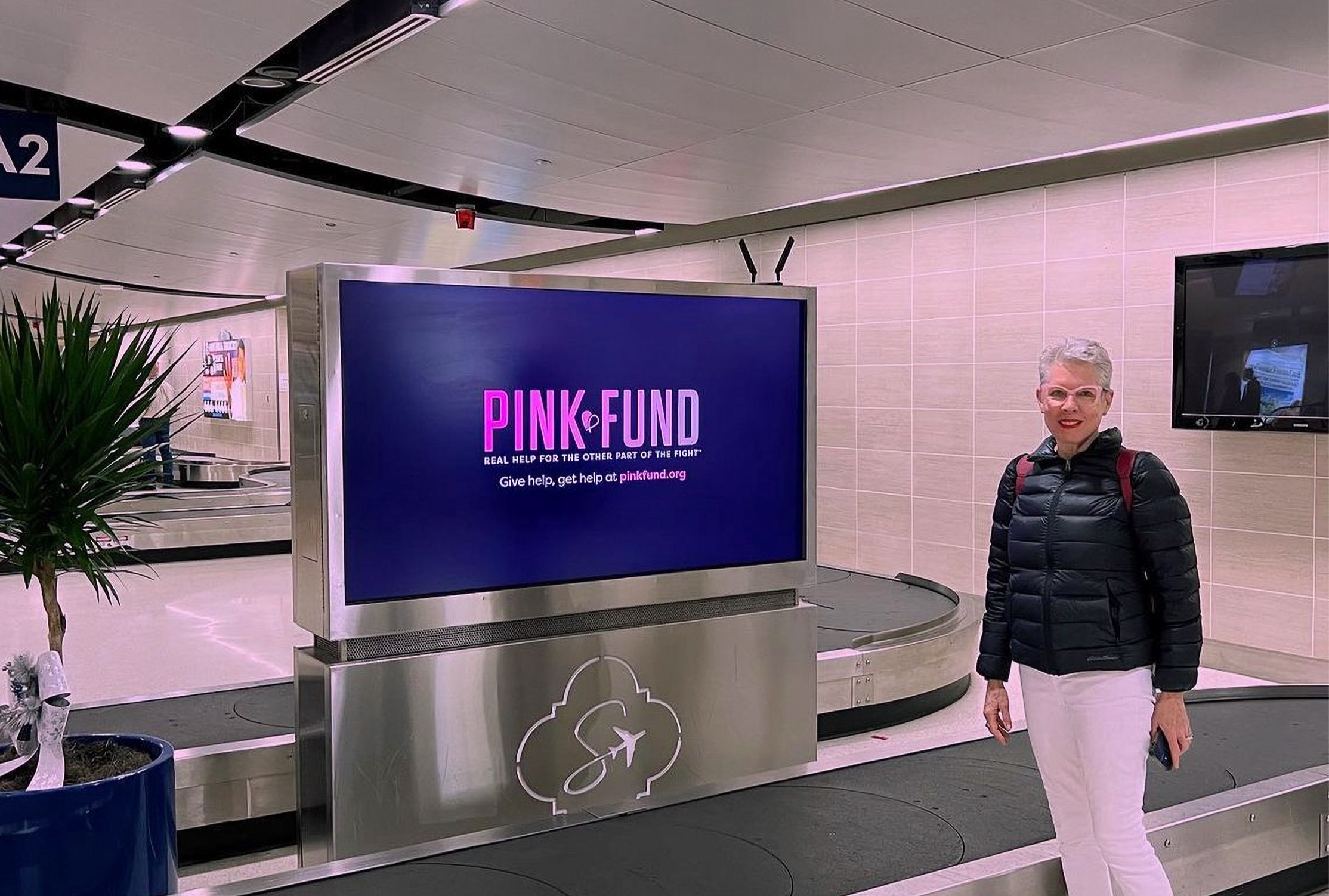
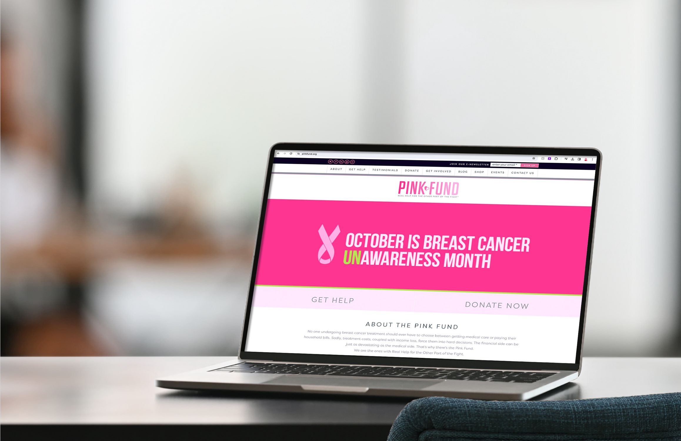
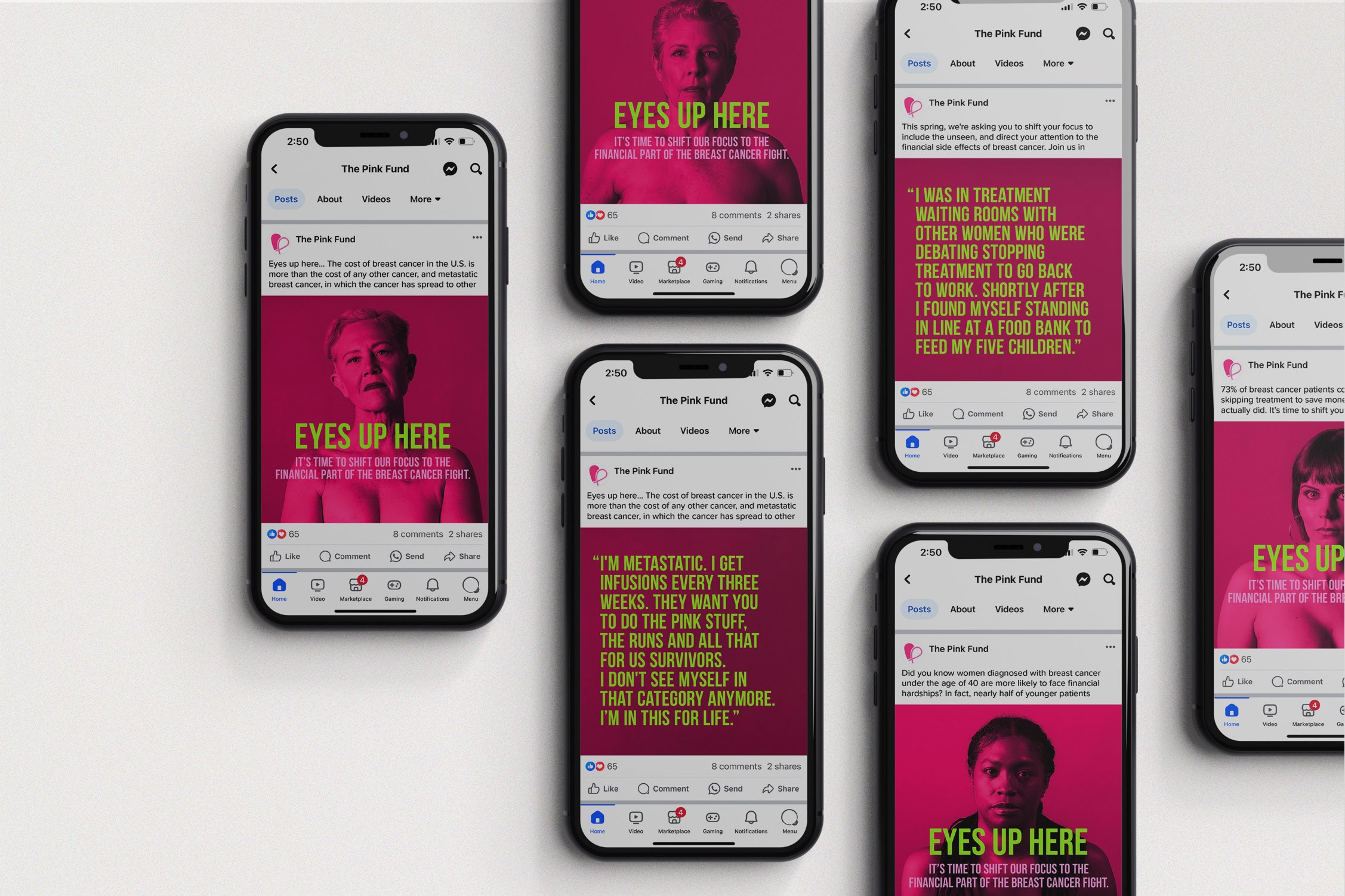
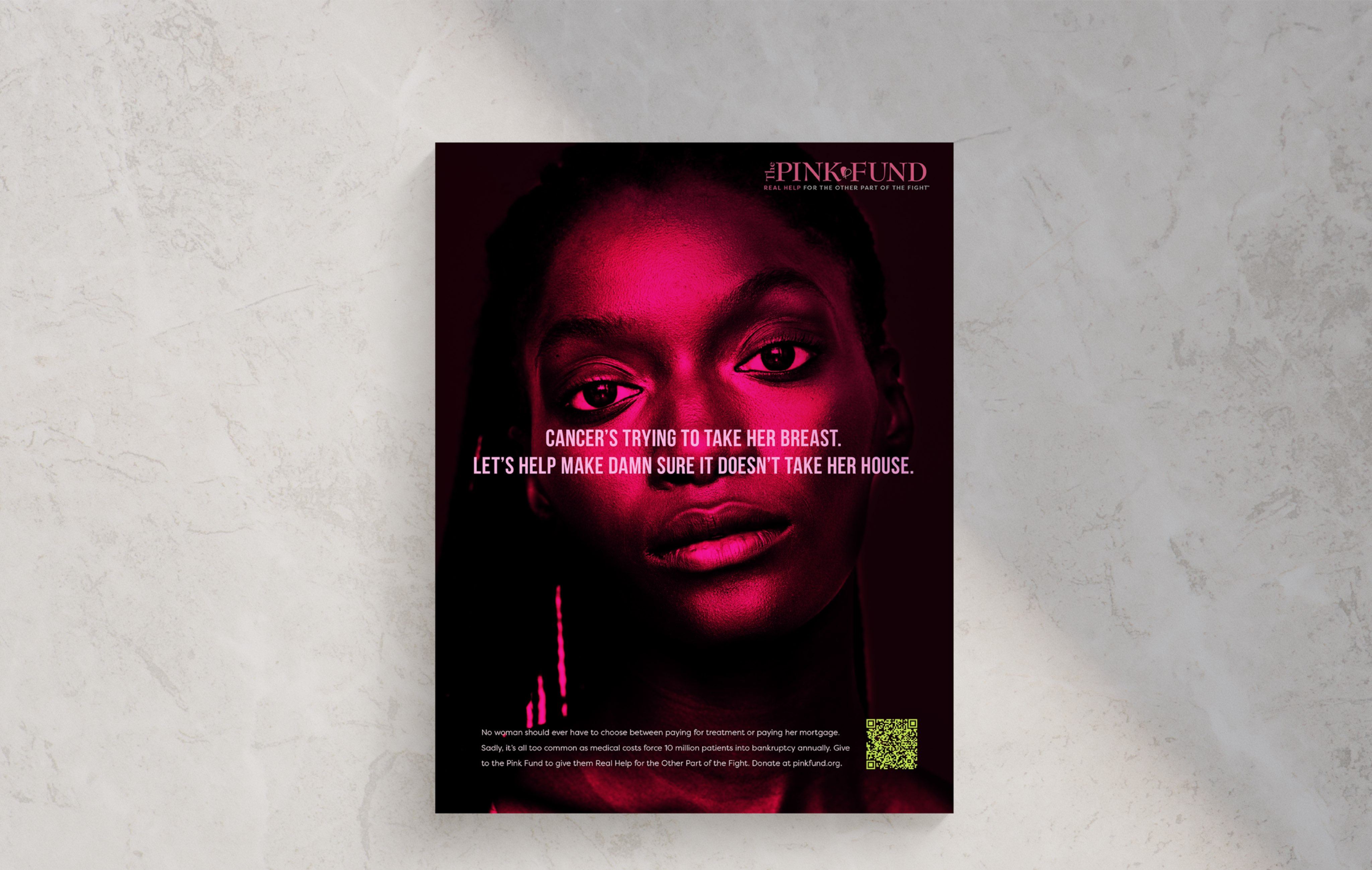
The rebrand permeated every corner of their communications platform, from online video, digital and social to direct mail, outdoor and business cards. We refused to be ignored and carved out a space for ourselves. Based on the stats above, mission accomplished.
CAMPAIGN
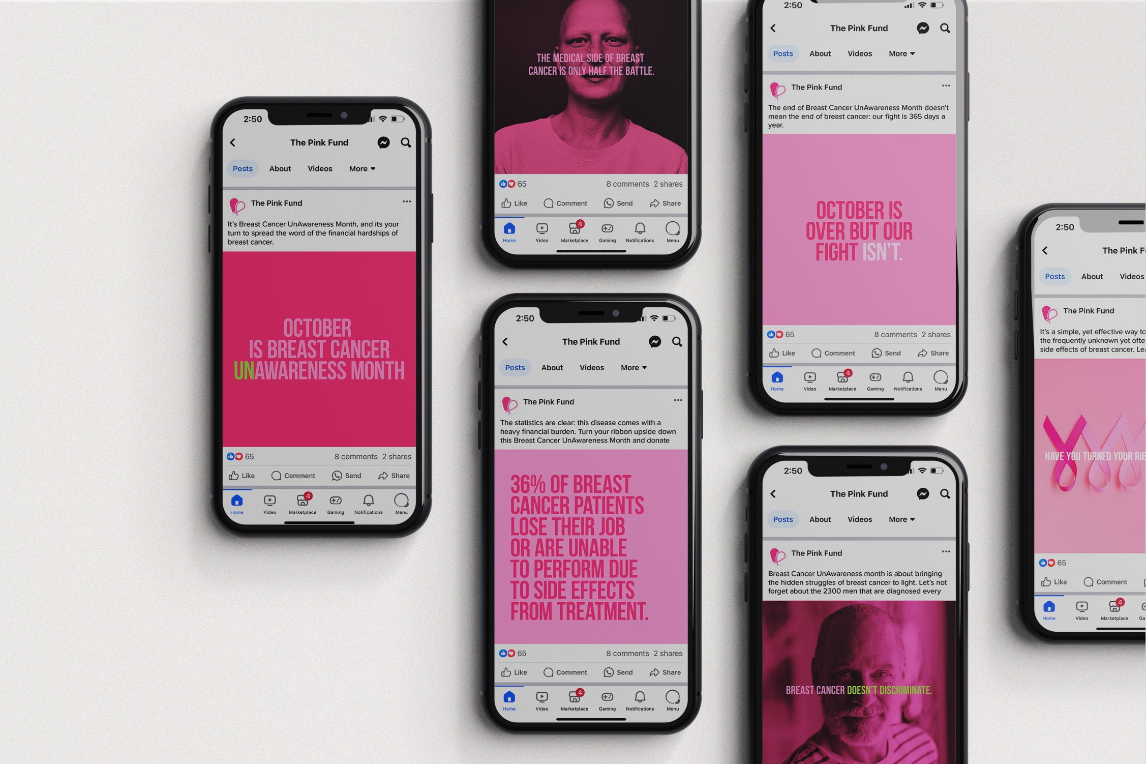
Breast Cancer UnAwareness Month
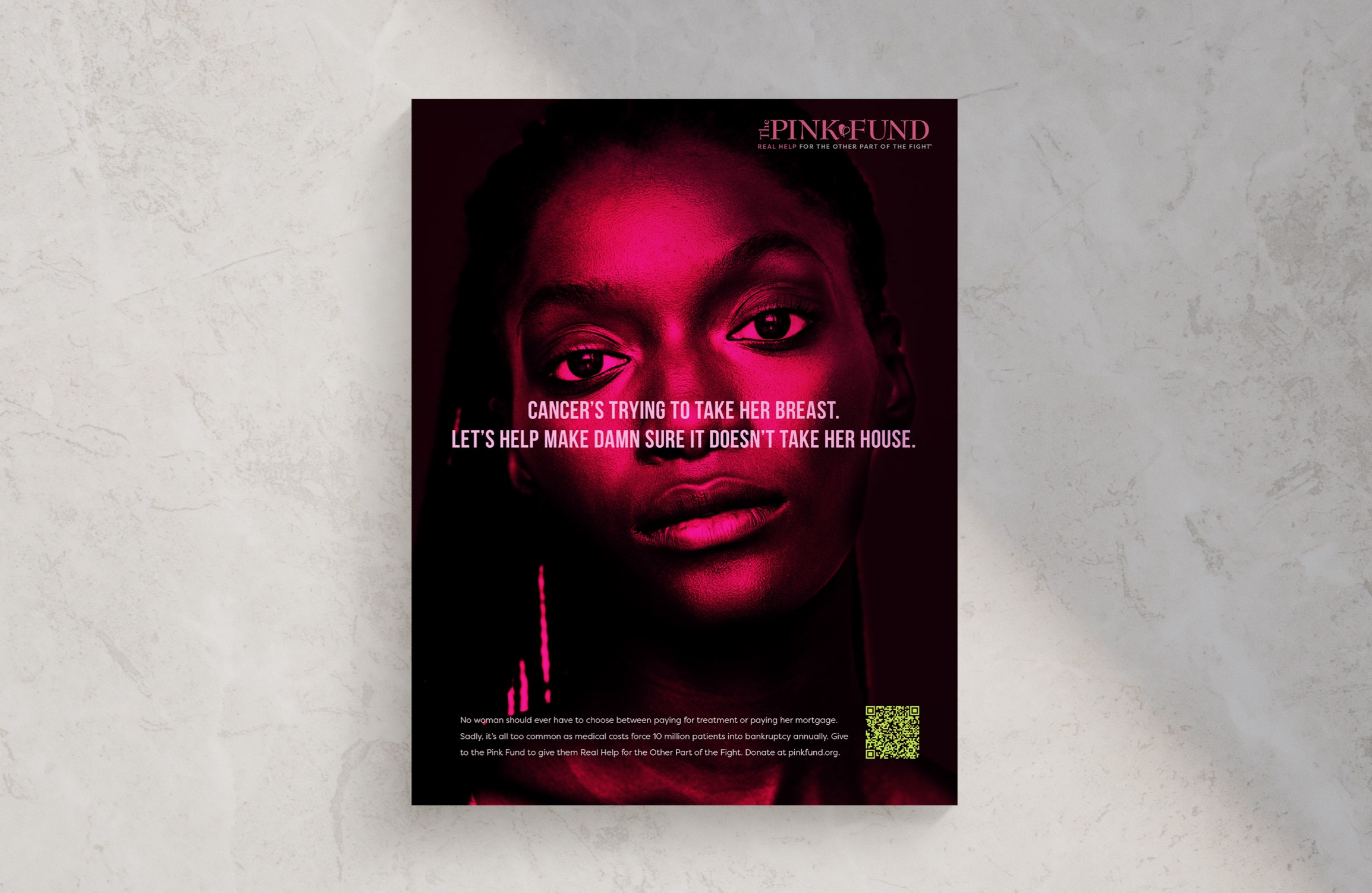
We turned Breast Cancer Awareness Month upside down by renaming it Breast Cancer UnAwareness Month – to bring attention to the financial burden of the disease. We even turned the symbolic pink ribbon upside down to drive conversations.
CAMPAIGN
Eyes up here
Directing one’s attention away from womens’ breasts, to focus on the more important issue at hand, is what got many eyeballs staring at Pink Fund. It featured Pink Fund beneficiaries who volunteered to be part of the campaign.
|
|
awards
Ad Age
Purpose-led Campaign of the Year
D Show
Best of Category, Low-Budget Integrated Campaign
D Show,
Best of Moving Picture-Non-Broadcast :60+
D Show
Best Low-Budget Campaign
D Show
Best Low-Budget TV, Video, Motion Picture


